Happy Saturday to you all.
If my content resonates with you, please share this email or send this link for folks to join 😊.
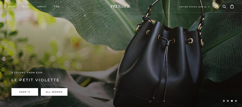
Here are a few tips on how to optimize your Shopify template.
Today's issue takes about 5 minutes to read.
Peep the scenario

The words used on your website will indicate to your customer that they need to stick around for a while.
Words are the most powerful tool in any form of marketing.
It's how we transact with one another.
It's a way to connect in its simplest form.
An image can say 1,000 words, but it's those words that bind us to that particular image.
The order those words are will keep the reader interested in reading more.
When done right, it can transform the reader into another place in their mind.
They can see your vision clearer, they can understand the landscape that you've created, and they're more invested in what you have to say.
This is why I know that messaging, imagery and information hierarchy are the 3 most essential components of your eCommerce website.
If you leave these 3 components to chance, then you're leaving money on the table and you will confuse or repel your customers.
When I first came up with this idea to write about, I thought "everyone probably knows this already."
But as I dug into it I realized that this is an important topic, and people need to either learn this or be reminded.
So let's talk about these 3 components and the best ways to utilize or optimize them.
Messaging & Imagery
Messaging and imagery go hand-in-hand.
In eCommerce, you most certainly cannot have one without the other.
But let's think of imagery being messaging little brother.
Imagery is essential, but if you can get messaging right, you're winning half the battle here.
With these 2 components, you do want to focus on a few themes...
Value - no matter what, your job as a marketer or founder is to deliver value at every turn.
Why is your product so unique?
What does it do that other competitors are not?
Why should your customers buy from you and not your competitor?
This sounds easy because you know that your product is so great, but how you can communicate that to your customers?
It ain't easy lol!
You have to dive into your customer's pain points.
Break down what they're going through and how your product solves that pain point.
And you should integrate your personal story and journey into your messaging.
Not every product needs a personal story, but whenever possible, it should be used.
Click here to see how to create a dope value proposition that resonates with your audience.
Images – icons, illustrations, and photography – should enhance your messaging.
They should add brightness and make your story come alive.
It should feel "real" when it all comes together.
Whichever emotion you're trying to convey, you're going to want your image to solidify it.
The quality of your image should be top-notch.
It should be clear, and easy to understand.
If you've never done photography before, then you should leave it up to a professional.
There are a lot of great companies that will give you top-notch photos at an affordable price.
Soona is one of my personal faves and a good place to start (seriously, don't take photos on your own if you've never been professionally taught. It never goes well, and in the end, your customers can always tell the difference).
Information Hierarchy
The way you lay your pages out will tell your story.
Image and messaging are very important the order of those elements is very powerful as well.
This can be a very tricky component to understand because every company is different.
Each eCommerce company can have different customers that are trying to solve a problem...
That is in different buying stages...
All by using just 1 design...
As I said before...it ain't easy 🤣
A great personalization strategy can definitely help with this, but you can't always rely on personalization.
The site does need to be able to stand on its own and convert the majority of its visitors.
I handle information hierarchy by delivering value, trust, and motivation in that order, on every page.
Here's how I put together the foundation of a homepage for an eCommerce website
[NAVIGATION]
[VALUE PROPOSITION]
[TRUST FACTORS (think UGC, reviews, etc)]
[FEATURED PRODUCT(S)]
[PRODUCT/BRAND STORY]
[PRODUCT DETAILS]
[TRUST FACTORS]
[FOOTER]
This is a great foundation and will help your customers understand who you are and why you're product is so great at solving their pain points!
See you again next week.
When you're ready there are 3 ways I can help you:
Work directly with me personally to help transform your business into a high-growth brand.
Take my free 3-Day Conversion Breakthrough Challenge to further beef up your messaging.
Follow me on LinkedIn to hear me ramble about all things eCommerce.


