Hey 👋🏿 – Anthony here.
Happy Saturday to you all.
If my content resonates with you, please share this email or send this link for folks to join 😊.
Here's one tip on how to optimize your Shopify template.
Today's issue takes about 5 minutes to read.
Peep the scenario
Let’s talk about Shopify templates today.
There’s a problem that people don’t like to talk about because it’s not sexy…
But your Shopify theme probably sucks.
My bad, I don’t mean to hurt your feelings, it’s really not your fault.
Shopify theme designers and developers aren’t in the trenches building and growing eCommerce businesses.
So they add features that they “think” you need.
And thus you’re pigeonholed into a design and functionality that was given to you.
And no matter how many bandaids you add to it, the broken foundation of your website is still there.
In this email, I’m going to review 8 default Shopify functions and features that are adding unnecessary friction to your website.
💡At the end I’m going to give you an idea that I believe can increase your most important metrics in a meaningful way!
Let’s first start with the first observation that I see on every Shopify theme…
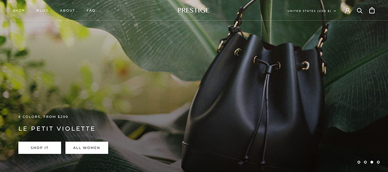
👉🏿 Hero carousel slider on the homepage
This is the main part of the most trafficked page on your website and you're not focusing on your value prop. Instead, you're giving your customers 2-4 different messages to focus on.
How to fix it? Use the voice of customer research to craft 1 message with 1 image that resonates with your target audience. We call this a value proposition and I've created the perfect tutorial on how to utilize this powerful tool in this article here. Also, as a treat, I've come up with an idea for a new carousel that could possibly help you convert better than any other hero carousel available. Skip to the end if you're curious 👇🏿
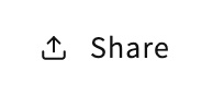
👉🏿 Useless social share functionality
This functionality has been on eCommerce themes since eCommerce themes have been created. Before Shopify even existed. And somehow, in 2023....it still exists! I'm my experience of customer research and experimentation, literally, NO ONE uses this functionality.
How to fix it? Just get rid of it. Use Shopify's customizer to remove this functionality from your website once and for all.

👉🏿 Lack of clear labels for navigation icons
You MIGHT know what those icons above mean, but what if you didn't know that circle with the line protruding out was a magnifying glass? What if you didn't know that clicking on the magnifying glass opened up search functionality? You're leaving it up to the customer to figure this mystery out and you're assuming that everyone that enters your site understands what these icons mean.
How to fix it? Have a developer add labels underneath the icons. This is literally a $10-20 job for the most basic web developer.
👉🏿 Frustrating product image vertical scroll with sticky content
This one is a bit harder to explain, but essentially to consume any information below the fold the shopper has to scroll through each and every image. every. single. time. 🙄 I've personally interviewed customers and ran surveys with shoppers saying that they're continually frustrated with the type of functionality. It's just not useful.
How to fix it? This would have to be a custom fix or you'd have to switch your them to one that doesn't include this functionality. If you're having trouble removing this functionality just give me a shout and I'll do my best to help you quickly fix it 👍🏿
👉🏿 Maybe the worst out-the-box review system for such a big eCommerce platform
The default review system for Shopify is one of the worst. You figure this out a few weeks after debuting your new website to the world. Shoppers rarely add a review without being prompted to do so, and Shopify doesn't have any email or SMS message to reach out to your customers to buy. They also let pretty much anyone go to your website and submit a review. So there's no way to know if any of the reviews on a Shopify website is legit. There's also...
- No image to show the face of the customer
- No way to know if the reviews are verified
- No user-generated content of customers using the product
How to fix it? Unfortunately, everyone must use a separate platform to create reviews. I personally like Stamped.io and Yotpo. They do everything you'd want and more!
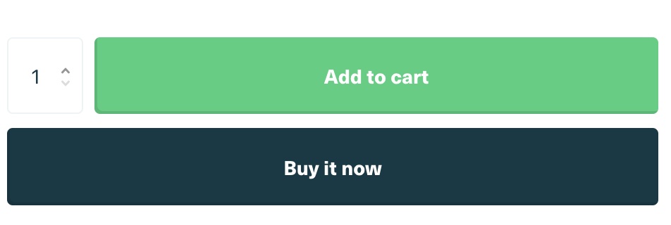
👉🏿 Asking customers to buy too soon with Buy Now buttons
In my experience in eCommerce, certain types of friction are ingrained in most shoppers. Viewing a cart page or pop-up is how eCommerce sites work and what feels comfortable to most shoppers. When you try to force them to the checkout page it makes the customer feel uneasy about buying with you. Why is the website forcing me to buy? Why are they so eager to take my money? Are they going to steal my information? These are some of the questions that a shopper may go through when you implement the Buy Now buttons, but Shopify still uses this feature as a default and most brands keep it that way.
How to fix it? Use Shopify's customizer in the 'Themes' section of your Shopify admin to remove the Buy Now button from product pages.
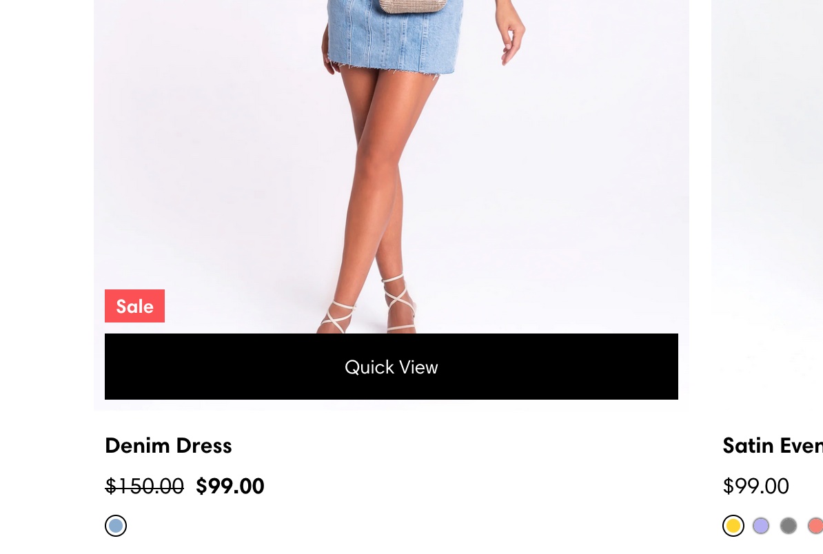
👉🏿 Default quick shop/quick buy
Unless you have a really huge product line, the Quick View functionality is most likely not for you. I haven't seen a great implementation of this on Shopify-based websites. If you have less than 20 products you should definitely remove this functionality immediately. The majority of your customers aren't using it. And if they are using it, they're not buying from it. If you do have a 20+ SKU brand, then be sure to A/B test the implementation of this functionality.
How to fix it? Remove the quick view functionality in Shopify's theme customizer. Instead, try using 'Add to cart' functionality (this would be custom so be sure to ask your dev team to implement it).
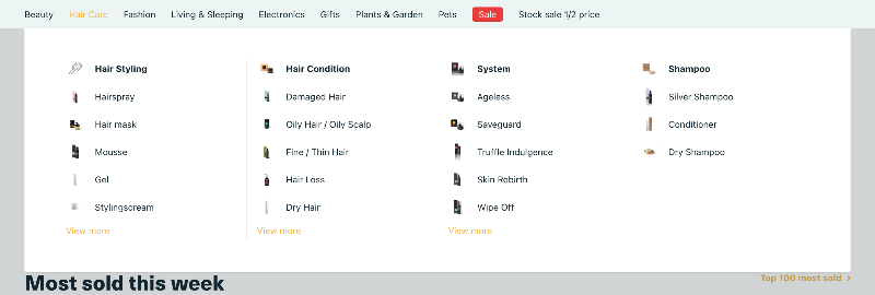
👉🏿 Mega menus
Most brand owners don't know this, but super mega menus are not a great user experience. It stops the customer in their tracks and now you're making them think about what their next move should be. What you want is the shopper clicking and searching the site, not stopping and thinking.
How to fix it? Give customers only the top-level navigation (in the example above that would be hair styling, hair condition, system, and shampoo) and give them a robust filtering functionality on the collections page. This keeps the customer clicking and searching instead of stopping and thinking.
BONUS: A new carousel system
As I was discussing the way homepage hero carousels are terrible for eCommerce websites, I thought about ways that a brand could actually utilize the carousel functionality in a more meaningful way.
For context, here's my LinkedIn post talking about the situation.
That gave me the following idea...
A story-based hero carousel.
The goal of every new brand is to tell a story that differentiates them from the pack. What if we used the carousel functionality to tell this story?
Here are a few wireframes below to explain what I'm thinking...
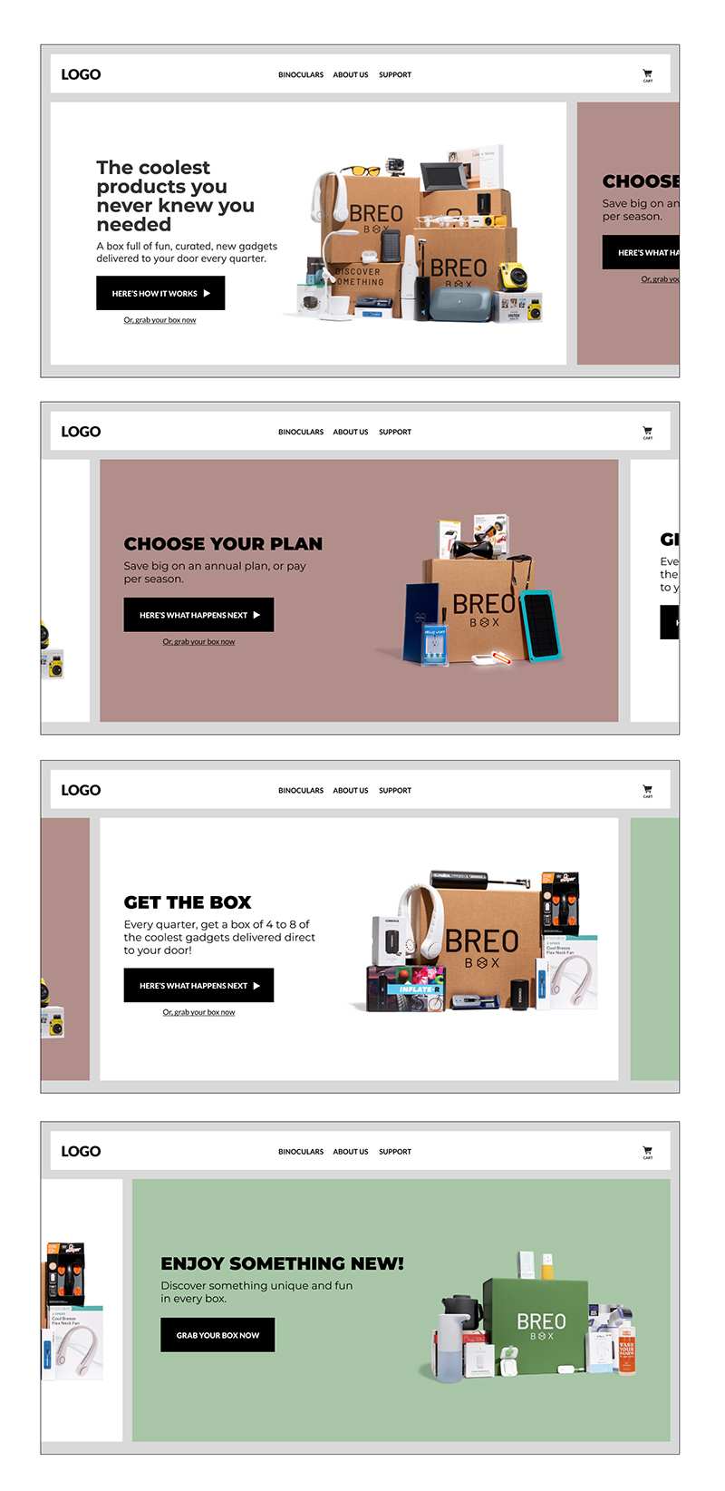
I think it's super interesting and could be a way to get customers more interested in what you're selling as well as get them to understand the true value of your brand.
This is an innovative way to bring more new customers into the fold.
Also, I'm looking for brands to test this on. If you have a brand that is bringing in a ton of traffic each week (think 10k users per week) please give me a shout as I'd love to experiment on this with you ❤️
When you're ready there are 3 ways I can help you:
- Work directly with me personally to help transform your business into a high-growth brand.
- Take my free 3-Day Conversion Breakthrough Challenge to further beef up your messaging.
- Follow me on LinkedIn to hear me ramble about all things eCommerce.