If my content resonates with you, please share this article and send this link for folks to join 😊.
Here's one tip on how to create the foundation of a conversion-optimized eCommerce website.
Peep the scenario
Alright, so you're about to spin up a brand new website for your new dog treat product.
You've hired a junior web designer and developer to build this out.
They know how to build a website but haven't had enough experience to know what to add to your website.
Where do you start?
What features do you need for this website?
What is going to be the messaging?
I'm going to cover all of that and more below.
Follow along as I list (in no particular order) the elements and features necessary to create a conversion-optimized website.
WARNING: Understand that these are just my suggestions from 10 years of being in eCommerce. There's no guarantee that your customers are 100% going to convert at a high rate if you use all of my suggestions. Please A/B test when necessary.
Now that we have that out the way, let's get to it 👇🏿
Here's my process for creating the foundation of an eCommerce website

👉🏿 Messaging / Value Proposition
The very first thing that I would create is the messaging for the website. Specifically, my headline, supporting text, and call-to-action.
I love to use the reviews of my competitor's customers to craft a great headline that I know will resonate with most of my audience.
If you're looking for ways to create your value proposition, I have an entire tutorial on how to do that from our second email.
👉🏿 Micro Conversions
These are the pieces of value that you offer to your customers that helps embed trust with your brand.
Micro conversions aren't big factors in helping with conversions, but they do stick with your customer and this can add to the motivation for them to buy from you.
To start you can use micro-conversions such as...
- Free Shipping
- 5-year warranty
- Save with auto-ship
I like to add micro-conversion right below the 'Shop Now' button in my value proposition as well as right below the 'Add to cart' button on the product page.
👉🏿Cross Sell & Post Purchase Upsell
Amazon has perfected the cross-sell game and it's for a good reason. It just works!
Here's a great example of an upsell from the brand Lora DiCarlo...

You're going to want to implement this right below the Add To Cart button on your product page.
Post-purchase upsells work fantastically as well. It's a great way to get more money from your customers on the back-end of their purchase.
This works well when you have a few key products that most people buy as you can easily upsell them on the other products that enhance that product.
I like to use the app Reconvert if you're on the Shopify platform.
👉🏿 Cart Popup
I almost didn't put this one on the list, because it's not always necessary.
Sometimes it's better to forward people to the cart page rather than having a cart pop up.
But I've done plenty of A/B tests where the cart pop-up won tremendously when implemented correctly.
To implement a cart popup you should have the following...
- A rewards system is placed at the top. For example, "Add $10 more and get a free doggy bone!"
- Big and clear product imagery and clear pricing
- Only a checkout button and a continue shopping button. The checkout button should direct to the checkout and not the cart page.
- Upsell app with add-to-cart buttons that automatically adds the product to the cart instantly
I've implemented a cart pop-up like this a ton of times and it's worked tremendously well in most cases.
If you're on Shopify I've used this Sticky Cart app tons of times, and it always works beautifully.
The brand Kettle & Fire has an amazing example of a beautifully implemented cart popup.
You should try and mimic what they're doing especially if you're in the consumables space.
👉🏿 Top Products on the Homepage
This is something that is featured on almost every single eCommerce website and it's because it just works.
On the homepage, you want to tell a story, and the story can't be told without showing the products.
It's best to include your top products as close to the top of the page as possible.
I like to include it right below the hero image (but usually I'll have
reviews in between both the hero image and top products...more on that below).
Be sure to give your top products a great headline too.
"A few of our favorites" works a lot better than "Best Sellers".
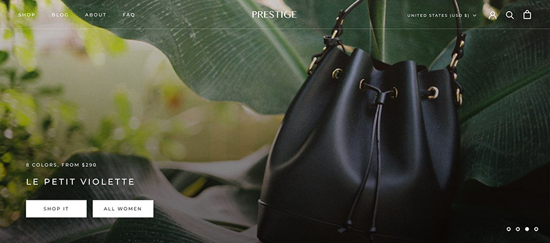
👉🏿 High-Resolution Imagery
I think this should go without saying, but because imagery plays a major part in conversion in eCommerce I have to make sure that it's pointed out.
Don't use stock photography if you can. Customers can smell that a mile away.
You want to have great lifestyle imagery no matter what type of product you're selling.
What does your product look like in the wild?
How is it used best?
Try to answer these questions using a model facing the camera and smiling.
For your product pictures, you're going to want these to be so detailed that it looks like you can pick them up off of the screen.
Go look at the products on Louis Vuitton or Gucci's website.
They take very care of the photo density of their products, and they look magnificent because of it.
Great imagery also helps with trust and most definitely motivation for the customer to buy.
👉🏿 Frequently Asked Questions or FAQ
It's hard to figure out the right questions that customers are asking, but to figure out how to build a proper FAQ you're going to need to do some research and have a lot of empathy.
I would first start with the competitor review mining as we discussed earlier.
That's going to give you a lot of insight into what your customer is looking for when purchasing your product.
Next, I would close my eyes and try to become your customer persona.
What do they do when they wake up and go every morning?
What type of food do they eat?
What type of games do they like to play?
I mean try to become your target customer.
Then go through your website and try to figure out what types of questions your customers would have as they browse.
You probably already have a few in mind, but I would take the time to conduct these 2 exercises to figure them out.
👉🏿 Reviews & Other UGC
Reviews are like gold for eCommerce websites when implemented correctly.
It's also one of the most abused forms of content on eCommerce websites, especially because most only show 4 or 5-star reviews.
When it comes to reviews you want to be like Amazon.
Show the 1 through 5-star reviews. Show everything!
If it's a damaging review, then I would suggest removing it, but you want to make sure that your site looks real.
Do not imitate brands like Fashion Nova and have to fork up $4.2 million because you didn't pay attention to how you collect reviews.
Also, don't place your reviews at the bottom of your homepage.
This is what you want people to see right away, and I like to place reviews right below the hero image and right above my top products.
You're going to want review stars next to every product on the collections page (if clicked, they should link directly to the reviews section of the product page).
And you're going to want review stars at the top of your product pages.
Do try to place UGC content from your social media sites on your homepage and product pages.
This adds an extra layer of trust and engagement to the site, especially when used on the product page.
I like shoppable UGC as well.
Meaning the customer can click and view the image as well as add the product to their cart from that screen.
It's a beautiful thing when done right.
👉🏿 Engaging email popup w/ SMS
Email popups are another abused form of content on eCommerce websites.
Nowadays the second you reach a website you're hit with a popup immediately.
This is bad news, as most of the people that will sign up will only want to sign up for the discount or to just remove the pop-up (I've seen this happen in remote user tests a million times).
This means that you will have disengaged subscribers and your open rates will be a mess.
Instead, show your pop-up to customers when they're engaged with your website.
Either as they scrolled down the page, or clicked into another page.
Make it intent-focused.
Also, please be sure to use a great headline here.
"Never miss another sale" works a lot better than "Get 10% off your first purchase".
👉🏿 Add to cart button on collection products
So this is a missed opportunity with most websites.
If you have over 10 products then you should include an add-to-cart button on your collections page products that adds that particular product to the cart instantly.
This helps customers that have been on the website before and know what they want.
This is important for consumable products because they tend to get a lot of repeat customers.
This is also something that I would consider A/B testing to be sure it's the right thing to do, but I would still implement it right away as most times it's the right decision.
👉🏿 Live Chat
Some companies are short-staffed and don't want to deal with the problems that come with implementing live chat.
I get it. Customer service can take away from doing other tasks that are important to the business.
But in my eyes, there isn't anything more important than your customers.
You want to make sure that you put them first at all times, and if they're confused you want to be there to help.
I would suggest keeping the live chat feature on for 2-4 hours a day in the beginning until you can hire someone to take over.
The reason I love a live chat so much is that it's a great way to get right in front of your customer as they're browsing your website.
You can get soooo much information from them about why they're there and what problems they're going through.
It can help you make more sales as well as help with your messaging as your actively doing voice-of-customer research.
Live chat can be powerful when implemented and used correctly.
👉🏿 Save for later
This can be a game changer especially if you're in the consumables business or if you have high-priced items.
But every site should implement some form of this feature.
Right now, there's a trend that marketers are starting to realize and they're calling it "carting".
It's where customers add items to their cart and leave it there only to come back later to purchase.
Whatever you want to call it, it's been happening for years (I know because my wife is a professional at this game lol).
Amazon has only added fuel to that fire by adding the 'Save for later feature which I think works phenomenally well.
To add this feature to your site, I've used this app on Shopify and it works well. Here's an app that works well with BigCommerce too.
If you need help implementing any of the features that I spoke about above or if you have questions, please feel free to reply to this email 😊
Boom! That's all folks.
See you again next week.
When you're ready there are 3 ways I can help you:
- Work directly with my team to help transform your business into a high-growth brand.
- Take my free 3-Day Conversion Breakthrough Challenge to further beef up your headlines and messaging.
- Follow me on LinkedIn to hear me ramble about all things eCommerce.